
Election Fever
Sunday 8 November 2020
 Have you been glued to the election coverage?
Clearly, we will all have different priorities for news, but rightly or wrongly, where I live and in my social media bubbles this week, the US elections have been front and centre. I'll spare you the personal interest and skip straight on to the mathematics teacher view. I have found it all ver compelling and particularly from a stats and modelling point of view. It has been a classic example of multiple issues with understanding and the media. Aided I think by the interest and enthusiasm that students are showing, the election coverage has given me so much to bring to my maths and ToK classes this week as well as department meetings! It is all ripe for the maths applications and interpretations class. I don't know how much of this will be useful when the election is longer current, but I suspect it will in one form or another which I will work on. In the mean time, I hope some of you can have some useful moments in your classrooms based on some of what I am sharing here if you haven't already...
The postal vote chase
So, for me, the most mathematically compelling event was/is watching what is happening in Michigan, Georgia and Pennsylvania. This came ot the for on Thursday morning when I saw this tweet from American Mathematician Steven Strogatz with the graphs from Wayne Kozun. I have seen similar graphs from others like John Haurum and can't be sure where and when they first appeared. To all those involved, I am grateful!
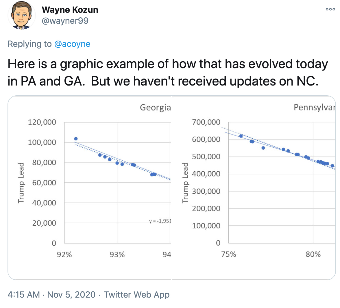
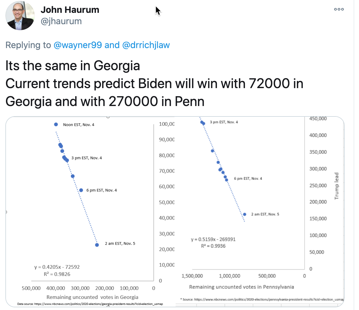
The basic premise at the time of sharing was that there appeared to be a pattern in both Georgia and Pennsylvania that showed how the Republican lead was diminishing as the percentage of votes counted increased in a linear fashion. If modelled and extrapolated as though it would continue, the suggestion was that the democrats would over take the Republicans before all the votes were counted. As I said, I found this compelling - it made me ask so many questions and we had an excellent conversation about these issues with my Maths AI class. We have a tight schedule, but there has to be room to get this kind of thing in when its topical - the opportunity is too rich. So what are the questions...?
- Where do the numbers come from and how accurate can we assume them to be?
- What reason is there that would give rise to such a linear pattern?
- What has to be true about the postal votes being counted late for this to go like this?
- What has to be true about the way they are being counted?
- How close is the correlation?
- What right do we have to extrapolate from these graphs and assume the linear pattern will continue?
- How we know 'percentage of votes counted?
- What else do we need to know?
- How likely do we think it is that it will pan out as predicted?
- What happened in the end?
There is so much wrapped in these questions that I highly recommend that you have this conversation with your classes so as to take the opportunity to ficus on issues of mathematics and knowledge in a real and relevant context. As this conversation continued in to my other classes, the staffroom and then our department meeting, here are some of the issues that came out...
- This is key as ever... a couple of the tweeters cited their sources and, as far as I could tell, there seemed to be a good level of consistency about the current vote count across different outlets. What I found harder was consistency amongst outlets about 'percentage of votes counted' see later point. Clearly, any issues with this could have a huge effect on the outcome. An opportunity to explore the impact of error on this modelling exercise.
- The media was consistent about the idea that given that Republicans actively discouraged people from postal voting and Democrats did the opposite (and lets stay away from the politics), it was likely that if the votes still being counted were postal votes, the chances were that a majority of these would be for the democrats. We asked questions about whether or not we could be sure about the fact that only postal votes were being added to tallies now.
- So clearly, this pattern will only be like this if, amongst the remaining votes there were, as predicted, a higher percentage of votes for the democrats. If true, then there are some good questions about how that proportion, the number of voters and the gradient of such a straight line should be related. There will be some good sequences in here, especially of we focussed on 'proportion of the votes'.
- Now this was a big discussion for us. This is not like a football game, where one team makes a comeback. It is only dramatic because of the order the votes are counted in and the results come in. If none of that was public and none of the results were announced until all were certain, then there would be none of this drama. Europeans and some others will know about the Eurovision song contest (and I think Australia compete now!?!) and the excessive drama of the voting game at the end. The result is already decided, there are no plays, the drama only comes from the slow reveal. SO, this gets interesting here. If we assume that only the postal votes are left AND that there is a majority amongst them that are democratic, then even that is not enough to be sure that your pattern will be linear. Results are announced in batches and so the pattern can only be linear if each of these 'batches' are representative of the whole population. So here we have an opportunity to explore the relationship between sample size and population. For example, if you know that 70% of remaining ballots are democrat votes, how sure can you be that a sample of 10 will have 7 blue and 3 red votes? OK, clearly, the batch updates were large samples in this case, but the point is valid and was a good discussion. A modelling exercise could easily explore the point at which that breaks down. Of course, with the slow reveal, the result will not change, but the validity of the linear argument and its extrapolation depends on the batch upload being representative. We had a good yarn about that at our department meeting.
- If the above is all true then the likely outcome is going to be a pretty strong positive correlation and it is great to see this example and understand why it would be.
- This is a great grey area. We know that, as IB maths teachers, we have been teaching students to recognise that using models to predict outside the range of the data given is not a valid idea. The tension has always been there though that in many cases, the primary purpose of modelling is predict the future. The current tracking of the coronavirus pandemic is a case in point. I would argue, that, in this case, given the conditions that describe what is happening, it is reasonable to assume a continuation, but it has to come with caveats about the impact that small variations in any of the variables could change the outcome.
- As I said above, I found that different outlets were reporting this differently, and I found myself doing some reverse percentage calculations to work out how many votes there should be still left to count. (You know, if there are this many votes cast and that is this percentage....) When I did this it seemed to make the extrapolated conclusion a bit less sure... Then, I would see changes to the vote count that did not correspond to changes in percentage of votes counted and this, coupled with different percentages being reported from different agencies then became my biggest source of doubt. Then I asked the question abut how this percentage was known in the first place? Was the total number of ballots cast known before counting started? If so then fine, there should be a problem here, but if not then we have all kinds of problems. How do you know percentage of votes counted if you only know votes counted and not total votes. Clearly I could do some more digging, but it is a key point that could be made clearer. Is there some kind of extrapolation from voting patterns elsewhere or in previous elections that has projected the total number of likely votes? That brings with it its own problems and considerations and, if nothing else, more uncertainty.
- We wondered,have their been similar situations? How did they pan out?
- Most of my class found the linear regression convincing. They accepted it would have uncertainties, but they thought it was pretty convincing. I follow a number of statisticians who felt the evidence was compelling and were content to call the outcome.
- As we know, in both Pennsylvania and Georgia, it panned out exactly as they suggested, base don the evidence given (any recounting etc is an independent idea and couldn't prove the model wrong would it? Just the result). Who was paying attention Arizona though? Many outlets had called this already for the democrats, but almost the opposite pattern appeared to be happening there. At the time of writing, it is still undecided and I have watched the democrat majority shrinking there over the last 2 or more days and so all the above questions need to be asked again!!!
So, on the whole, this particular tweet gave rise to such a rich opportunity to see so many of the Maths AI syllabus items in when very topical piece of news... but there is more too..
The gender divide
I picked up this tweet about the gender divide from Jane. It made me think about this activity, Independence Day about the likelihood of political preference being dependent on gender. The source is cited in the tweet.

Polling
So this blog post is probably long enough, but we had more good exchanges this week base don the final election prediction from FiveThirtyEight and the whole idea of polling and predicting in such uncertain complex fields with so many variables and human factors. Draw your own conclusions - have a read. Like I said, I feel some kind of case study coming on here, but for now I hope you can get the same richness out of this as I did. Would love to hear ideas, reactions or about what you have done this week!
...