Loggerpro Linear
Linearising
Linearising is the process of manipulating data so that it is possible to plot a straight line graph. taking the example used in this section; The change in temperature and the mass are related by the equation P=mcΔT/t.
Rearranging gives ΔT=PΔt/mc since P, Δt and c are constants then we can say that ΔT ∝ 1/m (ΔT is inversely proportional to m)
So if we plot ΔT on the y axis and m on the x axis we get a curve of the form y=1/x as shown in curve fitting.
If however we plot ΔT on the y axis and 1/m on the axis we will get a straight line since these quantities are proportional.
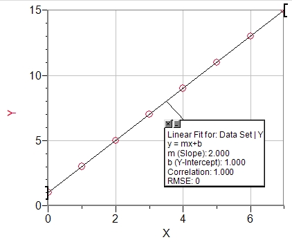
The equation of a straight line is always of the form y=mx+b where m is the gradient and b is the intercept on the y axis (see example below) which has the equation y=2x+1 so the gradient, m=2 and the intercept, b=1 as shown in the box.
If we look at the equation ΔT=PΔt/mc we can see that if ΔT is y and 1/m is x then this is of the form y=mx+b where m=PΔt/c and b=0

Why linearise?
In the old days when we plotted graphs with a pencil on graph paper the only way to make smooth curves was with a bendy piece of plastic with some soft metal inside, this gave a nice curve but not the equation. For that reason we linearised everything so that we could use a ruler to plot the line and easily work out the equation from the gradient and intercept. If we use a computer to plot the graph then we don't really need to linearise however it is much easier to evaluate the results if we do. If we take the example of the water heater then we can see that:
- increasing the power of the heater would cause the gradient to increase but what effect would it have on the curve? Not easy to visualise (well I don't find it easy anyway).
- The intercept is expected to be 0, if it has a positive value it could be because the values for ΔT are all too big due to perhaps to some systematic error. This would be more difficult to detect by looking at the curve.
To illustrate this here are some examples using some fabricated results from the water heater experiment. There are 3 different sets of data
- Different masses of water heated for 60s with a 2kW heater. (red)
- The same masses of water heated for 60s with a 2.5kW heater.(blue)
- A 2kW heater again but this time with a systematic error in ΔT, each value is 1°C to big. (green)
Curves

This graph shows the 3 different best fit curves plotted by LoggerPro.You can see how both the change in power and the systematic error in ΔT has shifted the line upwards. The value of A could be used to calculate the Power in each case since we know that the A=PΔt/c. So for curve
1. P=28.6x4200/60=2.00kW
2. P=35.5x4200/60=2.49kW
3. P=29.16x4200/60=2.04kW
So from this data we might conclude that the difference between 1 and 2 is due to a different power rather than a systematic error. There are sure to be some sophisticated ways of analysing the curves but they are beyond the level of this course and my brain.
Linear

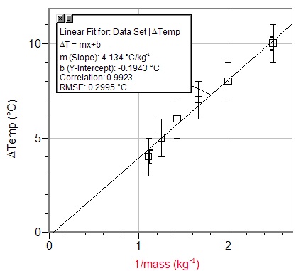
This is the same data but plotted against 1/m. Now it is much clearer to analyse the data.
- From the gradient P=2.00kW
- It is clear from the gradient that this has a higher power heater than 1. P=2.49kW
- From the gradient P=2.00kW but the intercept of 1.00 tells us that there is a systematic error in ΔT.
PLotting a straight line (kettle practical)
When we plotted the curve we plotted ΔT vs m this time we will plot ΔT vs 1/m so copy and paste the relevant columns from excel into Loggerpro and fill in the headers appropriately. You should see the points on the graph but if you don't then click autozoom.
If you have lost your data you can use mine. Excel spreadsheet
To plot the best fit line click the linear fit button ![]() . You will now have a graph with a best fit line on it.
. You will now have a graph with a best fit line on it.
Add error bars to the ΔT values by double clicking the header and choosing fixed value error bars from the options tab.
Customising error bars
When we plotted the graph of ΔT vs m we drew error bars to show the uncertainty in the values of ΔTand m, this was fairly straight forward since the uncertainty in each value was the same (±1°C for ΔT and ±0.001kg for m), the problem is that the uncertainty in each value of 1/m is different as you can see in the table on the excel page. To plot different error bars for each point you first have to add another column to the table in loggerPro. To do this;
-
choose "new manual column" from the "data" menu.

- Add a heading to the column so you remember what it is e.g. Unc. in 1/m
- Paste in the uncertainty in 1/m column that you have calculated in excel.
To add the error bars for 1/m to the graph;
- open the graph options dialogue box by clicking the 1/m column header.
- select the options tab.
- check the error bar calculations box.
- click the use column button and select the Unc. in 1/m column.
- Close the dialogue box.
- Note that the error bars are very small
- Add error bars ±1°C to the ΔT values.
Adding steepest and least steep lines
The point of drawing the graph and best fit straight line is to use the gradient to find some value (in the example above the power of the heater was found). When quoting a value we should always give the it's uncertainty, to find the uncertainty in a gradient we plot the steepest and least steep lines that will pass through the error bars. A simplification of this which is accpetable to the IB is to use only the first and last error bars. if doing this by hand you simply place your ruler on the error bars and draw the line, using LoggerPro is almost as easy.
-
After you have plotted the points and error bars press the "linear fit" button
 to add the best fit line.
 -
Now press the "curve fit" button
 , this will open the curve fit dialogue box.
 - Choose linear from the list of equations and then "try fit".
- By varying the values of m (gradient) and b (y, intercept) you can move the line so that it is steepest or least steep line that fits through the first and last error bars. When happy click OK.

Manipulating the lines in the dialogue box is a little bit fiddly but you can also move them on the full size graph, click the slope that is displayed in the little box and use the arrow keys to make the value bigger and smaller. if the increment is too big then double click the box and make it smaller. This is a bit difficult to explain so I made a video.
With the latest version of Loggerpro it's even easier using handles to move the lines. Double click the text box and select "enable line drag" then simply drag the line with the handles.
When you are finished you should have something like this:

The gradient can be quoted as the gradient of the linear fit and the uncertainty from ½(max gradient - min gradient)
In this case ½ (5.709 - 2.95) = 1.379 which is approximately ±1
So the gradient is 4 ± 1 °Ckg