
Uncertain about uncertainties
Sunday 31 August 2014
 Continuing the discussion on different ways to deal with the uncertainties in a gradient I have been playing around with some data trying different methods and this is what I have found out.
Firstly changing the size of error bars in LoggerPro does not change the displayed uncertainty in the gradient so the uncertainty is based on the spread of data not the error bars.
Secondly I tried a different but often mentioned approach to plotting the graph. I used data from the Density of Plasticine practical. The "usual" way of doing it would be to measure diameter many times for each sphere of different mass > find the mean diameter > calculate dmean3 > calculate (dmax3 -dmin3)/2 > plot m vs d3 with error bars. The resulting graph has an gradient with uncertainty based on the spread of data, the error bars are only for looking at.
Instead of doing that how about calculating d3 for all the values and simply plotting everything on one graph. To do this you have to transpose the data so that you have everything in two columns; the repeated mass values plus the d3 values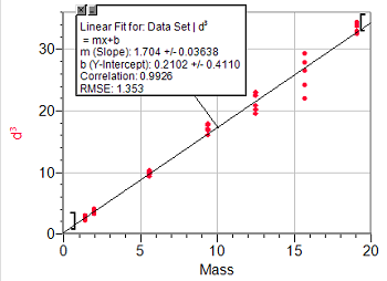 . Once this has been done paste create the graph and you get something that looks like it has errors bars but they represent the real spread of data. If you plot the best fit line for this you get an uncertainty based on all the data not just the spread of the means.
The question is, which is best? The second one certainly looks better, has a smaller uncertainty and a better intercept.
I think what has been happening is that physics teachers have been trying to adapt what they used to do with pencil and paper to digital solutions. Calculating d3 for all the data would have been a pain on the sort of calculator I had at university but is not a problem with a spreadsheet.